I learned a valuable lesson (pun intended) as I got started on a version of the
Road Trip Redux Quilt (more on this pattern later). I chose to pair a handful of solids with my favorite
Essex linen in black and a fun
black and white polka dot print.
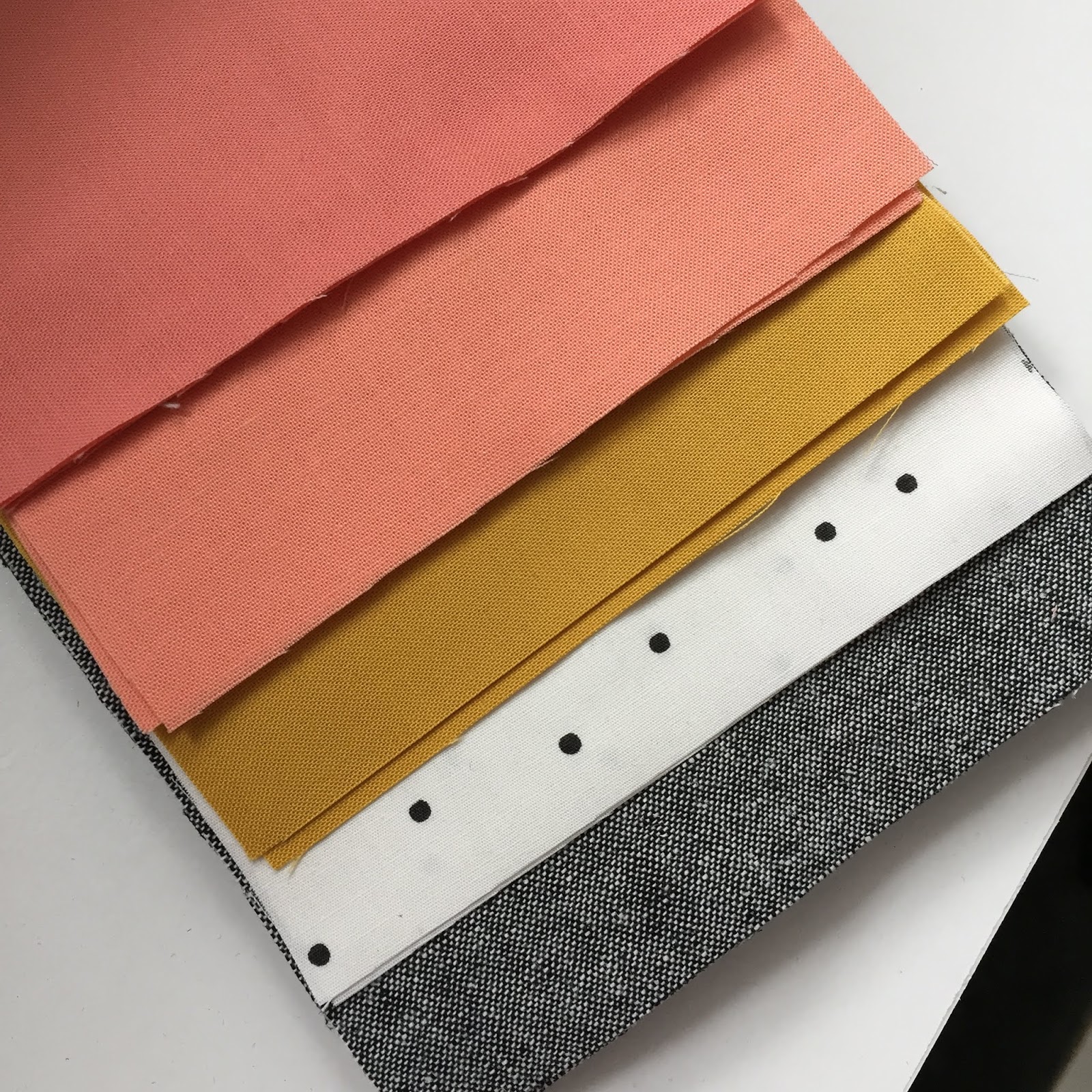
I wondered if the two corals were too close in value, but since they were both in my stash, I wanted to make it work. I made a test HST block and thought the difference in value would probably be alright.
However, when I put some of the blocks on the design wall, I found the difference in value was not great enough to make the design pop. The two corals are so similar, they muddy the layout somewhat - not what I had in mind.
Here is my rough color sketch to give you an idea of what I want the design to look like. I had already changde my mind about the pale yellow, opting for mustard for more of an edge.
A quick trip to my local fabric shop, and I think I have a solution. The bottom coral will replace the medium coral in the middle that I used previously. It has a noticeably lower value than the darkest coral, which I think will create the contrast the design needs. Watch this space.
No block will be wasted however, as a quirk in the pattern (okay, maybe user error - again, more on that in a subsequent post) led me to cut far more pieces than I need, so another Road Trip Redux Quilt is likely in my future, perhaps with other colors added too.


2 comments:
mistake or not, I love these colours!
Thanks for sharing! It’s very helpful for those of us who struggle with similar decisions.
Post a Comment