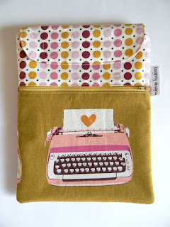
Well I made a concerted effort to tone down my second attempt at an i pad cover to appeal to general audiences. Thanks for all the love for version one; I'm pretty sure most of you are fabric nerds, like me! And I'm not sure this is much "better" than the first in that regard. :)
But I gave it to my friend today, and she loved it. Success! I kept the adorable Ruby Star typewriter print and So Sophie dot. I like the flap I created at the top and found yet another Hope Valley print that coordinates for the lining of the pocket and inside. I used fusible fleece this time. It worked really well. Now that's done, I can get back to some quilt ideas I've had on my mind.


I love both versions, but then I'm probably a fabric nerd ;)
ReplyDeleteThese turned out so lovely...and I love the colours of both too!
ReplyDeletex
Love this one too!
ReplyDeleteThis one is cute too, but the other one did not need toning down. That is crazy talk! ;)
ReplyDeletebeautiful! the new/improved flap is a win, for sure.
ReplyDeleteI love your ipad cover. The Melody Miller's typewriter print is a really nice fit I think. I would imagine doing one like this for my sister. She would LOVE it.
ReplyDeleteThis is awesome. Fabric nerds unite!
ReplyDeleteit's beautiful! nice fabric choices!
ReplyDeletethanks for linking up to finish it up FRiday!
Very cute and functional! I love your fabric choices!
ReplyDelete